SneakySwing:
Launching an AI Golf Coaching App from 0 to 1 and beyond
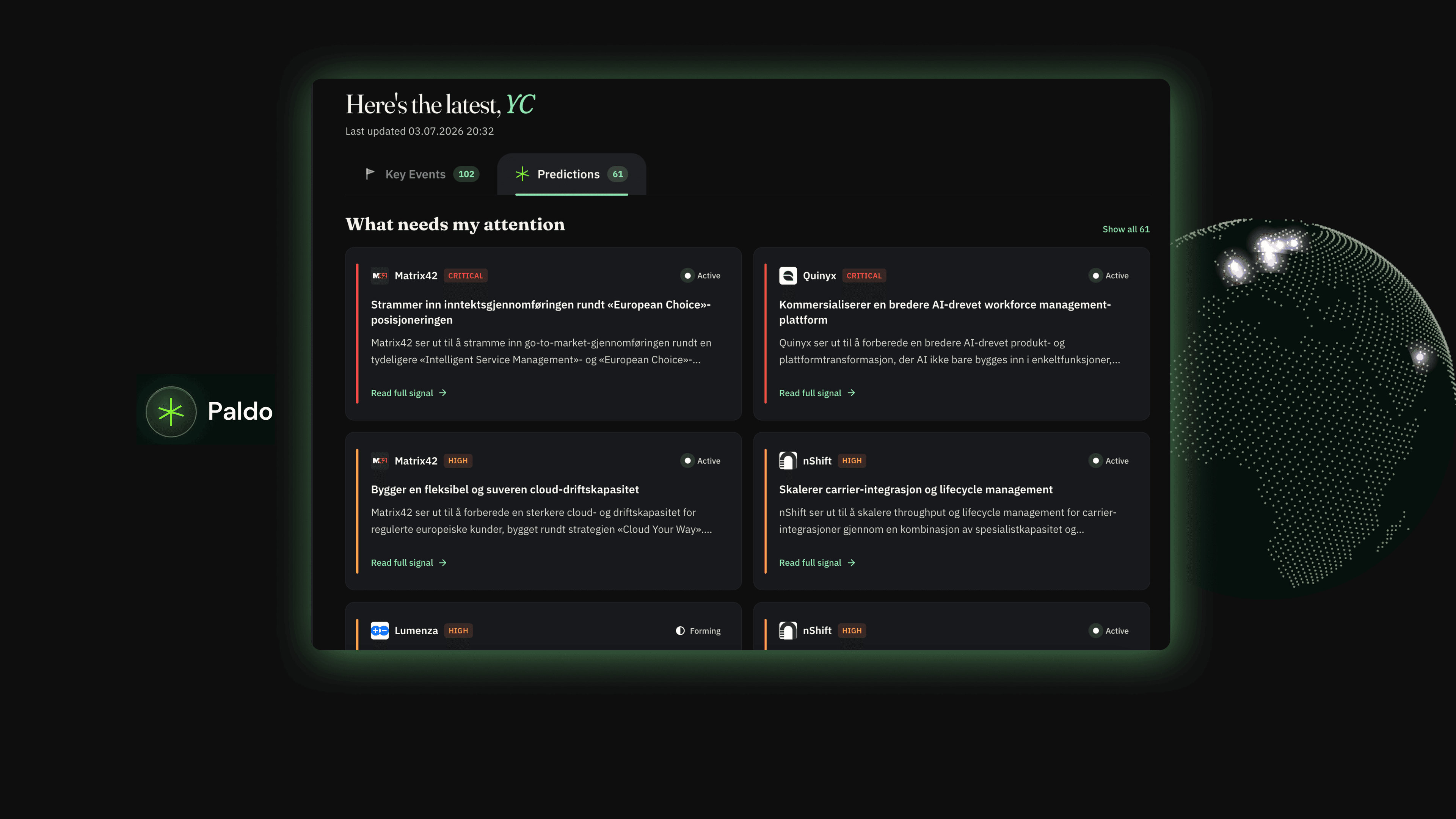
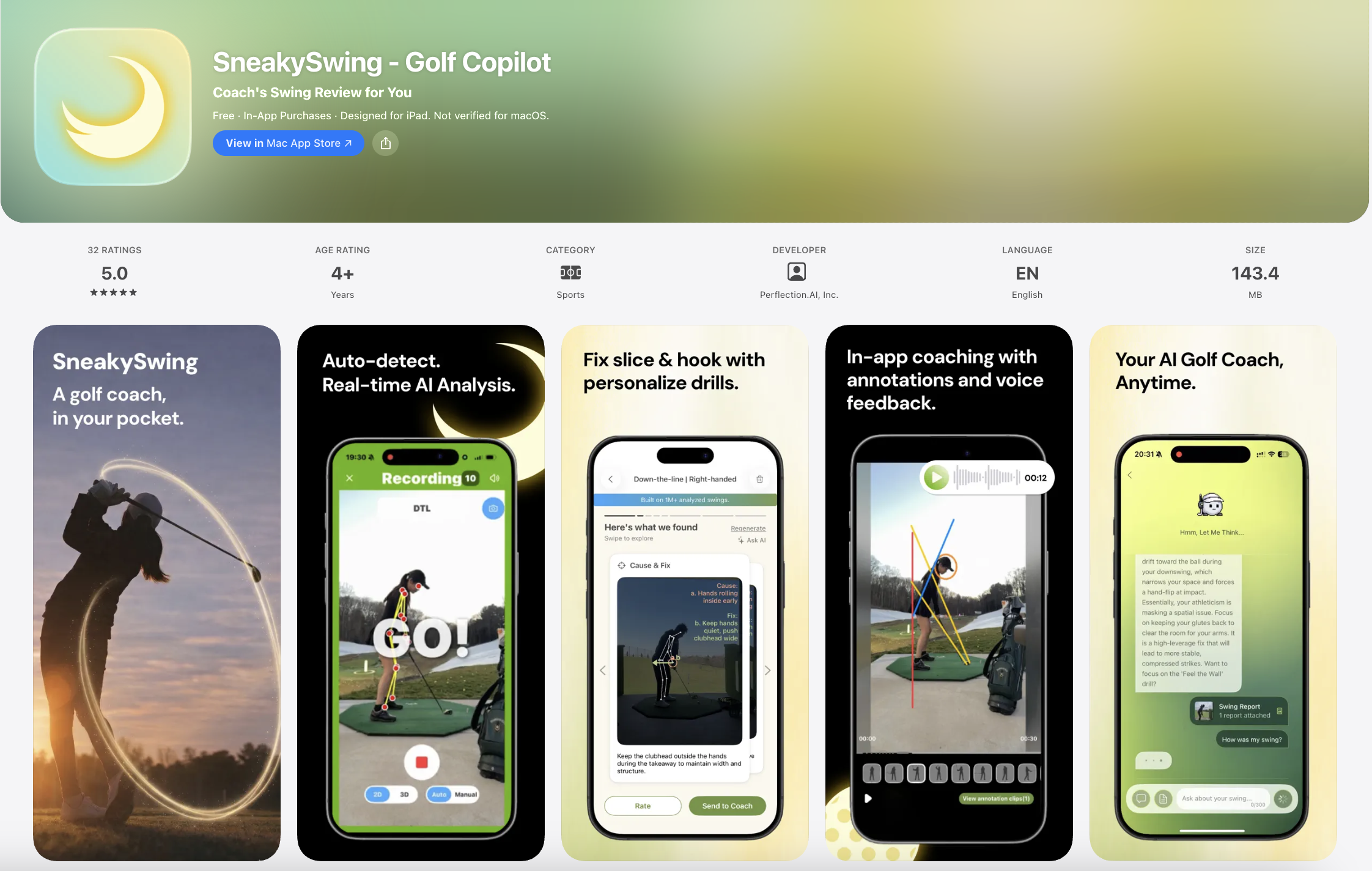
SneakySwing keeps coaching going between lessons through an AI-native ecosystem. It gives students real-time feedback backed by their coach's “digital twin,” while giving coaches a scalable platform to manage students and monetize their expertise.
Download on iOS ↗My Role
Product + Design
Timeline
Feb 2026 – Present
Team
TL;DR
Owning Product and Design, End to End
Working on a small team with no PM, I owned both the design and product decisions behind user flows: from identifying what to build, to designing it, to working with engineers on what was feasible to ship.
Shipped
Designed and shipped SneakySwing to the App Store from 0 to 1.
1500+
Users since launch.
26% → 53%
Onboarding funnel improvement — from download to first AI swing report.
44%
Weekly active users sustained post-launch.
Background
Led the Product Transition from Beta to Public Launch
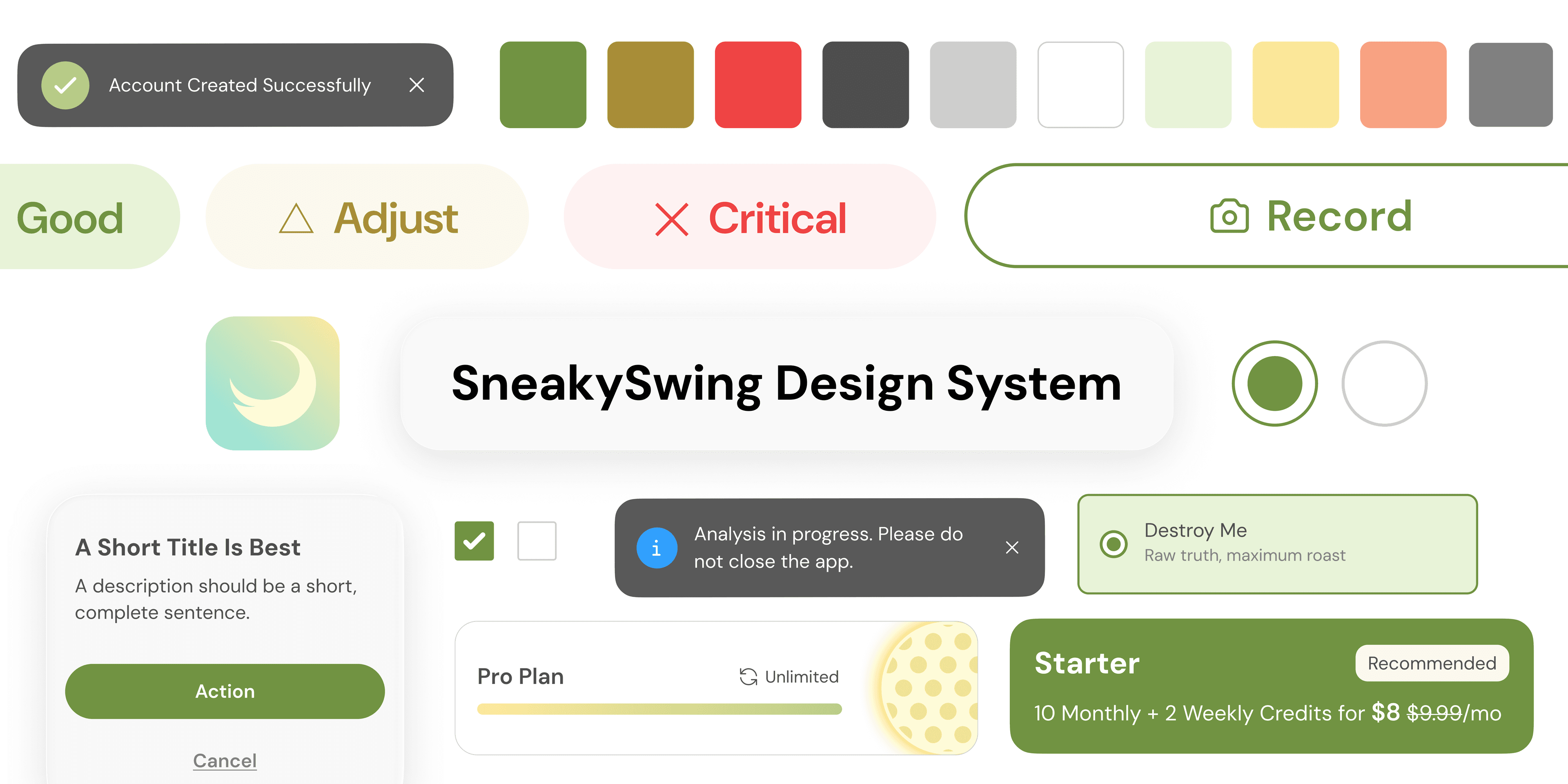
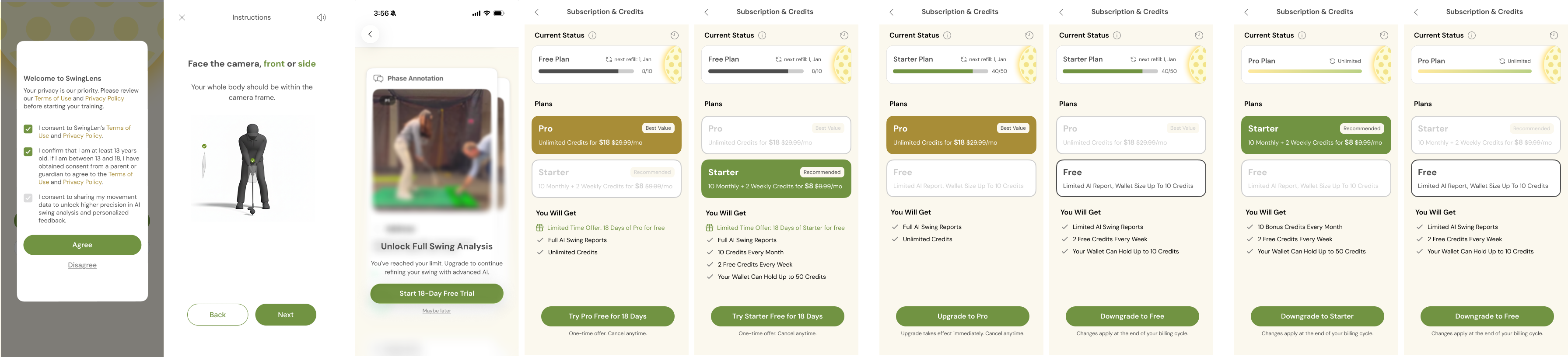
When I joined as the sole designer, the product had working tech but no coherent experience. With launch weeks away, I took ownership of restructuring the core flows, building design systemClick to see case study, and designing missing interfaces such as recording instructions and subscription.
The Problem
After Launch, Only 26% of Users Reached the Aha Moment (Generating First Report)
I started redesigning onboarding right after launch, after looking into the funnel data in PostHog. There were two clear drop-offs, and this was critical to fix before pushing harder on growth. Since they were relatively low-risk problems, I moved quickly on two hypotheses.
Onboarding
1st drop off
My Hypothesis
Value wasn't clear before signing up
2nd (main) drop off
My Hypothesis
After sign-up, limited guidance toward their first report
Goal
Guide Users to their aha moment and drive activation
The first fix was value-first onboarding: showing a preview of the report before terms and sign-up, so users understood what they'd get and were more willing to commit. The second was a walkthrough guiding users through the core flow once, so they knew exactly how to reach their first report.
Welcome Screen
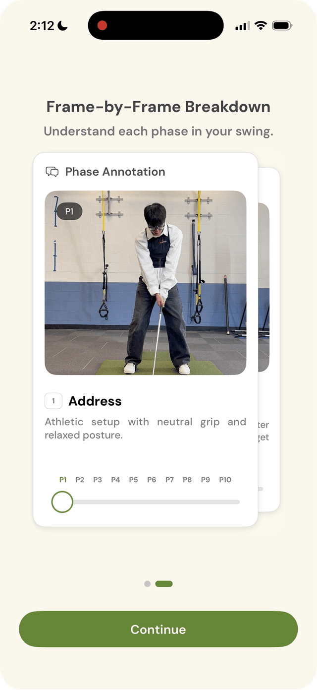
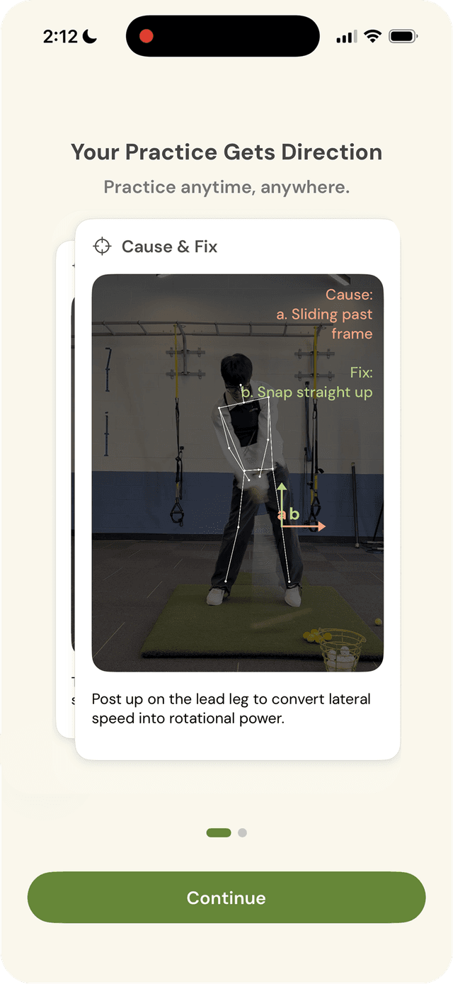
What's New: Value-first onboarding before commitment
Terms Agreement & Signup
What's New: Coach marks
Result
Friction down, activation up
26% → 53%
Activation rate
+27%
Overall funnel improvement
+18.05 pts
Registered → AI Report step
Onboarding changes are cheap to test, so I moved fast and let the data validate the call.
AI Report Pain Points
The Report Is the Aha Moment, But We Were Losing Users There
After onboarding improvements lifted activation to 53%, attention shifted to the next drop-off: the AI report itself.
Cognitive Overload
Unlike a real coach who focuses on 1–2 fixes per session, the AI report delivered every insight simultaneously, overwhelming users.
Design for one clear takeaway. Users shouldn't have to hunt for what matters.
AI Wait = Churn
Frame breakdown (15s) then motion analysis (60s+) make users churn.
Turn dead air into engagement. The goal is not just to fill time, but to reduce the felt wait, so users stay present instead of drifting away.
No Trust
Our brand was new to users with no signals about where the analysis came from. PGA coach backing existed — but wasn't surfaced.
Make the AI accountable, not a black box. Users need to know who's behind it and how it works before they believe and trust what AI says.
How much a user trusts the AI depends on how much they already know about golf.
Golfer Personas by Skill Level
When they first open the AI Report
"I don't even know if the report is right..."
- ·Unfamiliar with golf jargon
- ·Too many problems at once, no sense of priority
- ·Disengages from confusion
Needs simpler language without jargon, and a clear focus on what to fix first
"Oh wow, the report gets exactly my problem."
- ·Seeing their own flaw in the report creates an instant trust moment
- ·But unsure how to act on it or what to drill next
Our most promising segment once we pair trust with a practical, actionable next step
"Where is this data coming from?"
- ·Skeptical of AI credentials
- ·Needs individualized depth
Needs credibility signals + advanced detail
Solution Ideation
Evaluating 3 Layout Solutions
The focus was solving Cognitive Overload by redefining the report's information architecture.
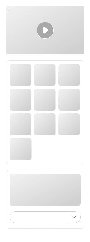
I pitched 3 layout directions to the founding team, evaluating each against technical constraints, product goals, and team bandwidth, while keeping extensibility for future features in mind.
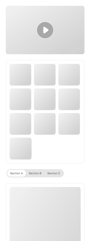
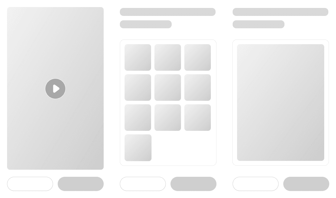
A · Tabs
B · Accordion
C · Horizontal Cards
Pros
+Balanced info load per tab
+Closest to the existing UI with lower dev cost
+Prioritizes primary content and hides secondary details
+Easy to scan and absorb without extensive scrolling
+Closest to our vision of an AI-native report
Cons
−Tab labels must be precise, or users won't find what they need
−Still feels long overall
−Content placed later gets less attention
−Higher dev cost
Horizontal Cards was the best option.
Unlike tabs or accordion, cards are inherently modular. Each card is an independent unit that can be reordered, replaced, or generated on demand.
→Aligns with our vision of a truly personalized, AI-native report where users prioritize the insights they care about, reorder cards by dragging, and let the AI generate the next insight based on what they engaged with.
Design Trade-off
Personalization vs. Onboarding Friction
Golfers deeply value personalization. However, AI feedback feels generic. Should we ask profile questions (goal, skill level, handicap...) during onboarding to give AI more context?
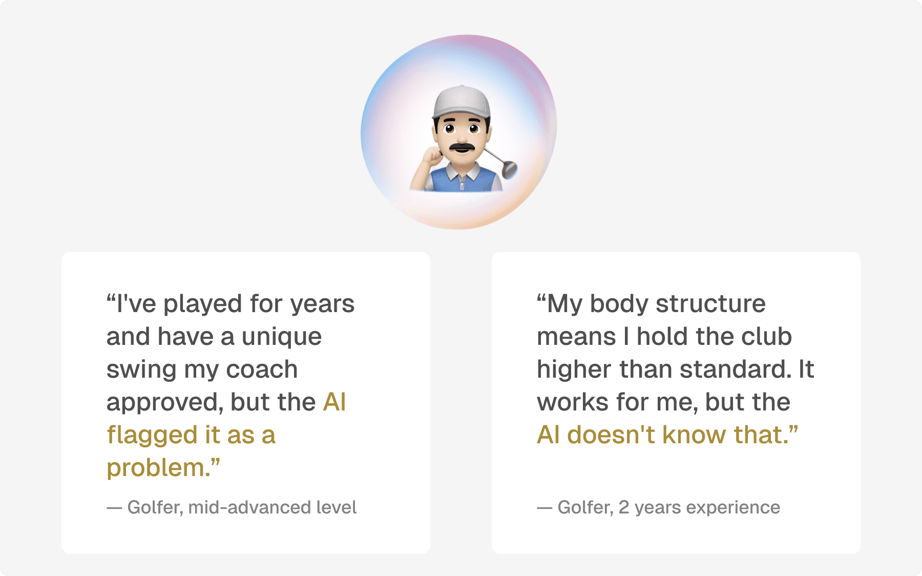
The concern
Adding too many steps before users experience any value may risk losing them during the long onboarding process.
Decision
Moved profile setup to the report generation step. While users wait ~30 seconds for the AI report, collecting their profile questions here reduces perceived wait while giving the LLM more accurate context for a better analysis result.
Jump to see →Final Solution
New Features Designed to Solve Cognitive Overload, Churn, and Trust
1. Collecting Profile Questions
During report generation, a bottom sheet invites users to answer a few questions.
- →Collecting user context that makes the AI analysis more accurate and personalized
- →Gathering user and acquisition data that benefits internal teams
2. Add Credentials
During report generation, a ticker rotates trust signals, such as "Built on 1M+ analyzed swings. Validated by PGA experts."
- →Increasing trust in AI
- →Reduces felt wait time by giving users something to read
3. Help Users Reach the Last Card
The horizontal layout reduces cognitive load by showing one card at a time. To maintain completion rate, the report auto-advances every 4 seconds.
- →Higher report completion rate
- →Users retain ownership through manual carousel navigation
Designing an AI Agent
You can't script a flow. You can only define boundaries.
1. Boundaries & edge states
Set boundaries for what the agent can and can't do.
E.g. Out-of-scope questions, session drops.
2. Entry points & conversation design
We placed the agent only where context already exists.
How the agent breaks the ice, and when it should ask a follow-up.
Insights from data and on-site interviews
We shipped a lot. But did people stay?
Week 1 retention, whether someone came back within their first week, actually dropped after the redesign: 68% down to 56%. The lift we expected never showed up, so I went back into research.
Week 1 Retention

I went to the range and talked to golfers to find out why.
We Shipped
Trust Ticker
AI Agent
Turned Out
Users never looked at it. Trust wasn't just an information gap.
Users noticed it, but didn't think to talk to it. On PostHog, only 17.9% of active users ever reached it.
Not a UI/UX Problem. A Positioning Problem:
We assumed trust in the coach would transfer to the digital twin. To users, it read as a second-tier coach. Therefore, we repositioned the AI to cover the time the coach can't see:
→ Golf is 90% solo practice, so the copilot watches live, cues in the moment, and recaps for the coach.
Reflection
One-Way Doors vs. Two-Way Doors
What I learned is that whether a decision is reversible changes how much rigor it deserves. Onboarding was a two-way door, so I shipped first and let the data decide. The AI report redesign was a bigger bet: we researched the problem but didn't validate the fix with users before investing engineering time. So for the copilot, a one-way door, users are in the prototype loop before we spend a single sprint.
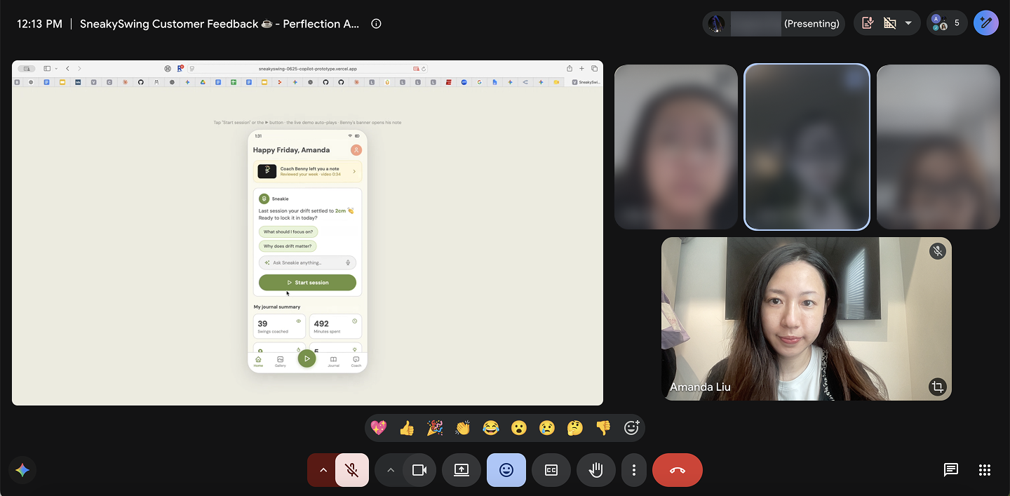
For irreversible decisions, prototype with users before spending a sprint.