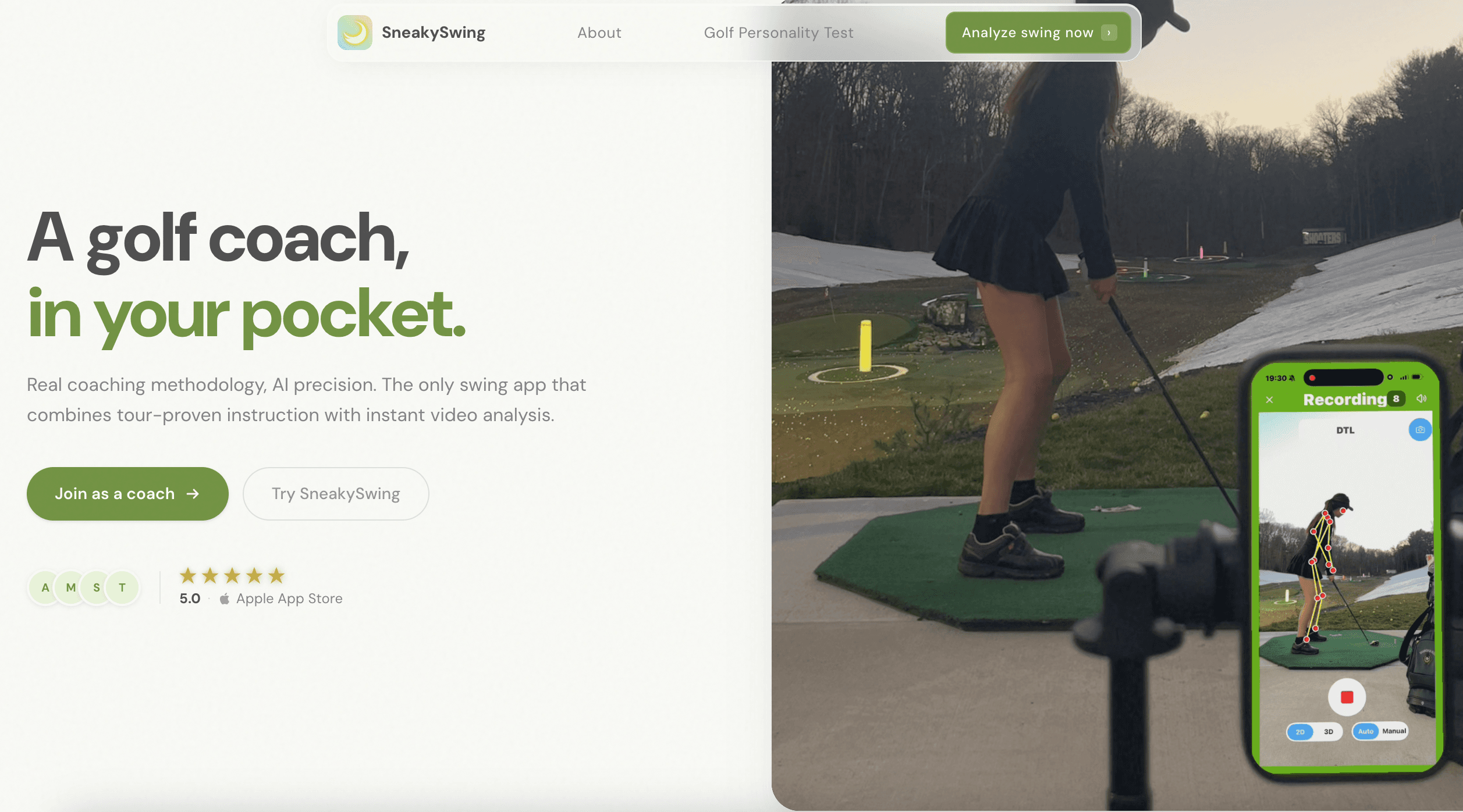
Building an AI-Native Design System That Lets Anyone Ship On-Brand

Built a complete design system — tokens, typography, components, and WCAG AA compliance embedded at the foundation. This gave founders, design, engineering, research, and marketing a shared visual language and the infrastructure for on-brand vibe-coding.
Time
Feb 2026 – Mar 2026
Role
Founding Designer (Design System Lead)
Tools
Figma, Claude Code, GitHub
Team
TL;DR
Designed with Human Taste
−30%
Reduction in development time per new UI component after system adoption.
6 Tickets
AI-driven codebase alignment tickets, each with generated code snippets ready for engineering.
10+ Members
Gave 10+ team members one source of visual truth across all deliverables — including investor pitch decks, official website, vibe-coded features and surveys.
WCAG AA
Accessibility standards met across the full component library.
I used Claude Code to run a codebase gap analysis, translating visual audits into 6 actionable Jira tickets with AI-generated code snippets. This streamlined the adoption process for our engineers.
Problem
Fractured UI and Unstructured AI Workflow


When I joined, token naming was a mess. There was a confusing mix of purpose-based and size-based labels (font-title vs. font-16). Also, I found as many as 22 different font styles across the codebase.
01
Auditing the Fragmentation
I joined as the 4th designer on a team with high turnover. Over time, isolated decisions had led to a fractured UI. When no designer was available, engineers shipped features themselves. I found mixed typography, inconsistent colors, and a lack of shared components or WCAG compliance. I realized a design system had to be my priority.
02
Aligning with Stakeholders
I discussed with the engineers to pin down our technical foundations: the tech stack, dark mode requirements, and platform constraints. By framing the system as a tool to “reduce development time,” I earned their trust and gained codebase access. What I found in the code was even messier than Figma, highlighting a growing technical debt that made a design system urgent.
03
Building for Scale
I systematically unified styles and components across Figma and the codebase. I replaced random naming with a semantic structure. Additionally, I ensured every color pairing, text style, and component met WCAG 2.1 AA standards.
From
Visual Inconsistency
Fragmented UI styles across user flows.
Communication Gap
Lack of tokens leads to slow, error-prone handoffs.
Compliance Debt
UI fails to meet basic WCAG AA accessibility standards.
Unstructured AI Workflow
Lack of systemization hinders AI-native speed.
To
Unified Source of Truth
Establish a shared system of tokens and components.
Optimized Velocity
Eliminate decision fatigue and accelerate design-to-dev delivery.
Accessibility by Default
Ensure all foundations are fully WCAG AA compliant.
AI-Native Readiness
Build a framework that empowers consistent "Vibe-Coding."
Solution
Building a System Both Humans and AI Can Read
✦AI Workflow
I used an internal AI agent to surface the right components to build, then used Claude Code + Figma MCP to generate first drafts. I directed and refined with high efficiency instead of starting from zero.

01
Consolidate and Name Styles Strategically
From:
A confusing mix of size- and intent-based labels, with 22 font styles.
To:
Intent-driven naming. Tokens like font/size/title-cta provide instant clarity. Values can be updated centrally, allowing everything to sync automatically. Reduced to 7 font styles.

02
Define Semantic Colors
From:
Manual hex picking across screens and components. Additionally, color roles were overlapping. For instance, Red 500 functioned as both a feedback and an error color.
To:
Semantic tokens shift the focus from colors to roles. For designers, selecting status/success ensures that the visual logic remains intact. For engineers, code becomes self-documenting; using brand/primary provides instant context and replaces guesswork.


03
Ensure Accessibility across Components
From:
No accessibility checks.
To:
WCAG 2.1 AA (4.5:1 minimum contrast) is embedded at the token layer by default.

04
Write Specs and Usage
From:
Scattered component decisions with no clear usage reference.
To:
Structured specs with usage guidance, variant states, and do/don't examples for consistent implementation.


Design-to-Code
Adoption Was the Real Challenge
The Design System was ready, but how do you implement changes across hundreds of legacy screens at once?
Building the system was only half the battle — the real challenge was migrating hundreds of existing UI. At the time, the engineering team was focused on shipping new features, making Design System adoption a lower priority. To accelerate the rollout and lower the barrier to entry for them, I took the initiative to automate the audit using Claude Code.
By connecting Figma MCP with our GitHub Repo, I ran a gap analysis that revealed critical inconsistencies such as:
- Typography Mismatch: The codebase relied on .systemFont (SF Pro) instead of our brand font (DM Sans). It also lacked definitions for line height and letter spacing.
- Color Debt: I found 31 redundant color sets in Assets.xcassets with duplicate definitions and incorrect hex values that deviated from the new system.
✦The Delivery
After validating the technical feasibility with the engineers, I bypassed the manual back-and-forth by creating 6 high-priority Jira tickets. Each ticket included AI-generated code suggestions from Claude, providing engineers with actionable starting points for their refactoring.

Impact & Result
One System, Every Surface
✦By syncing our Figma design system directly to a real-time design-system.md file:
- 01Founders used it to refresh investor pitch deck visuals
- 02Developers used it to revamp the website visuals
- 03Engineers can rapidly develop MVPs
- 04Researchers can generate on-brand surveys


Website, survey and vibe-coded personality cards, all powered by the design system.
10+ MEMBERS
empowered AI-native workflows
−30%
development time
6 TICKETS
AI-driven codebase alignment
WCAG AA
accessibility standards met
Reflection
Delivering Design as Code
The boundary between designer and engineer is blurring. With the power of AI, design is now done in code to become living and breathing. This allows people like me from non-technical backgrounds to provide Markdown/JSON files, or even automate audit workflows (from design-system.md to GitHub to Jira tickets) to create a custom Claude "Skill."
While Claude Code is transformative, it still experiences hallucinations. For example, my design-system.md occasionally included styles I never actually defined 😵💫. This reinforces that human oversight remains essential to maintaining quality. Overall, this project allowed me to reach a depth of understanding that would not have been possible by staying only on the canvas.


