Redesigning a competitive-intelligence product's color system and signal dashboard
Paldo is a Europe-based startup backed by Antler that recently closed its pre-seed round, focusing on strategic intelligence for leadership teams.
I redesigned the dashboard to highlight predictive signals at key decision points, and created a scalable design system to improve visual consistency and unify components across the product.
My Role
Product Designer
Timeline
June 2026 (1 Week)
Team
TL;DR
Pitching Design Before There's a Designer
Paldo is an early-stage startup with no designer. They had no shared visual identity across channels, and their most valuable feature (predictive signals) was buried in the dashboard's navigation. I pitched the co-founder on why investing in design now, as they're scaling to more surfaces and clients, would save them compounding rework later.
Deliverables:
Clickable Prototype
Beyond Figma, created in HTML
Design System
Color tokens, semantic mapping, component specs
Accessibility Audit
All tokens validated against WCAG AA
Problem
When Design Gaps Hide Product Value
When I audited the product, two problems stood out:
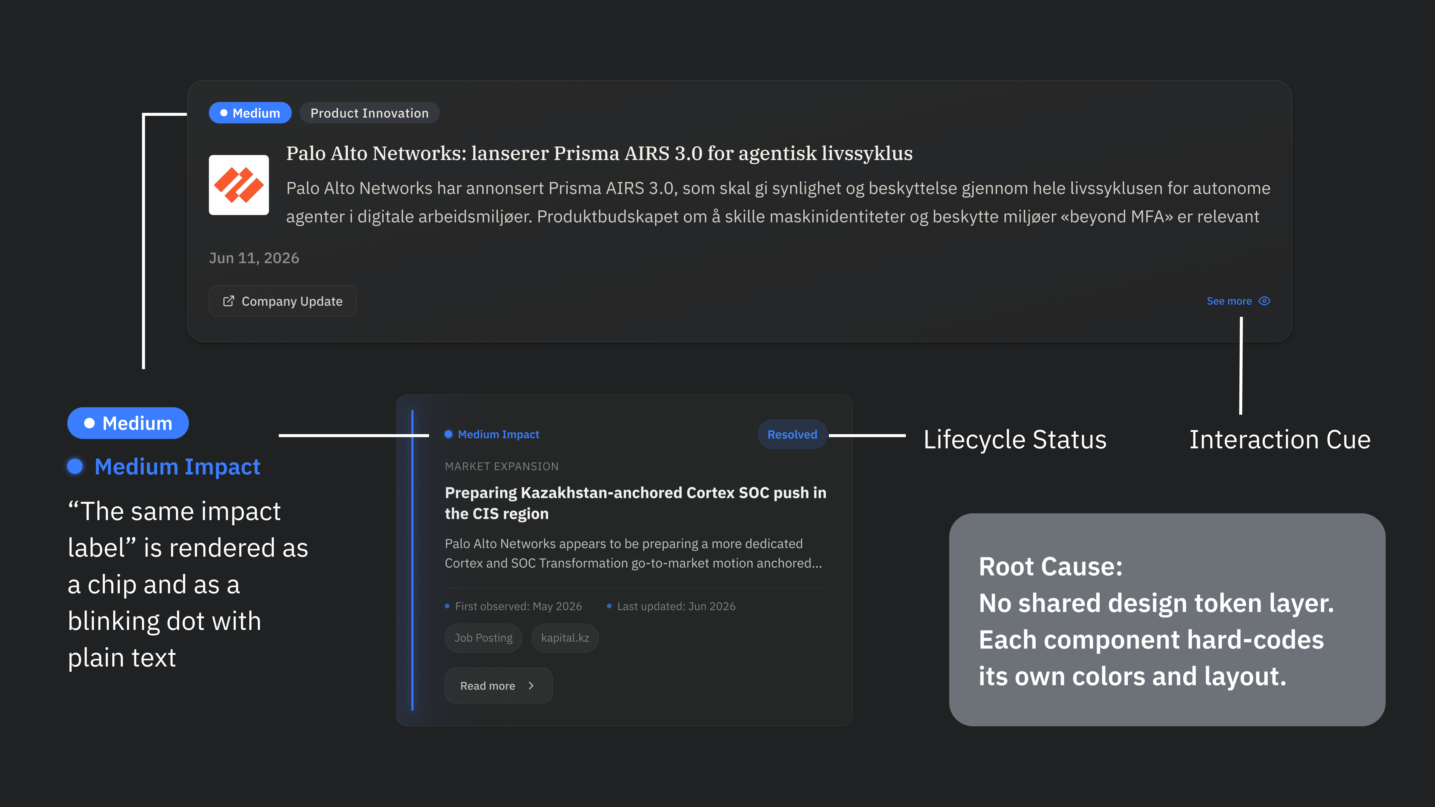
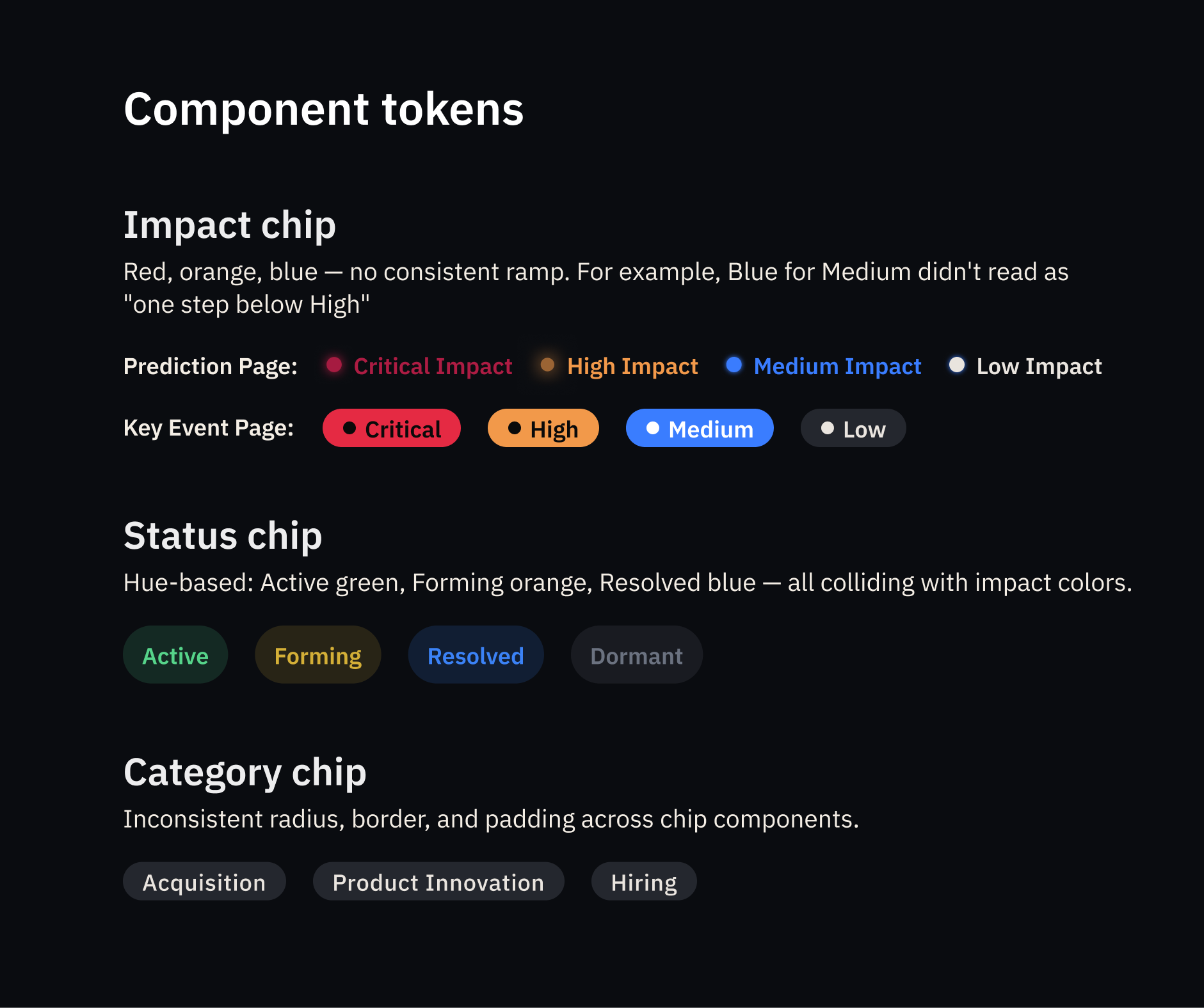
Same color, different meaning. Same meaning, different components.
Dashboard, website, and email all used different colors and component patterns. There were no shared tokens or semantic color system to build from.
Blue carries multiple roles across the dashboard — interactive elements, status indicators, and impact levels all share the same hue with no semantic distinction.
The dashboard buried its own differentiator
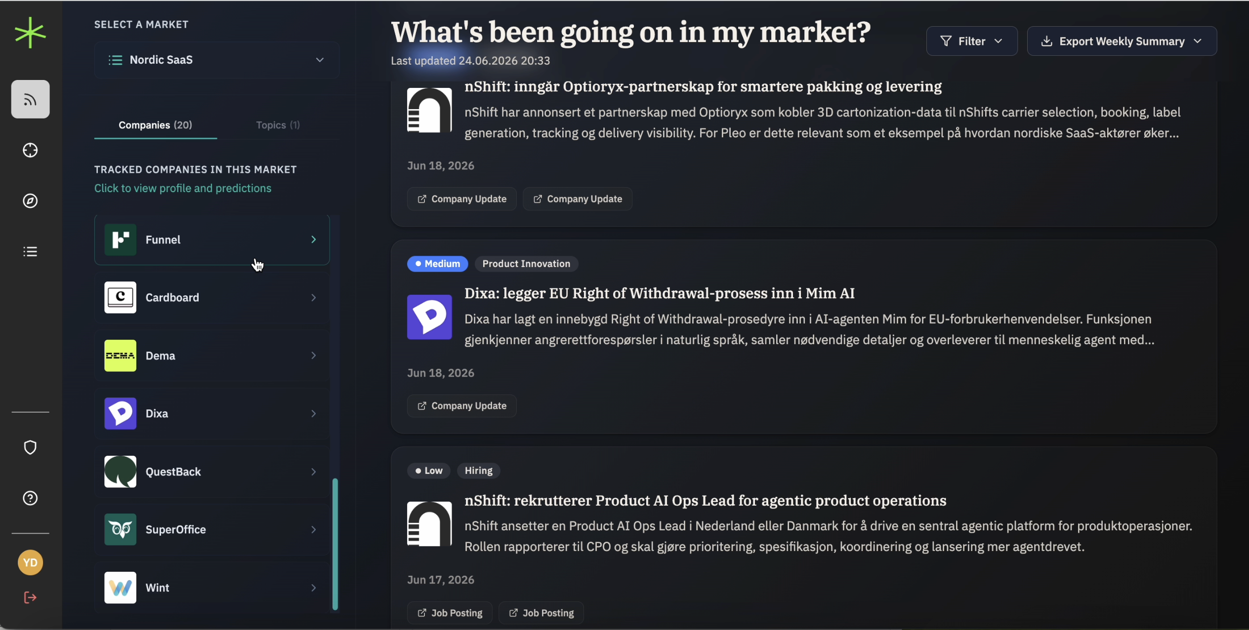
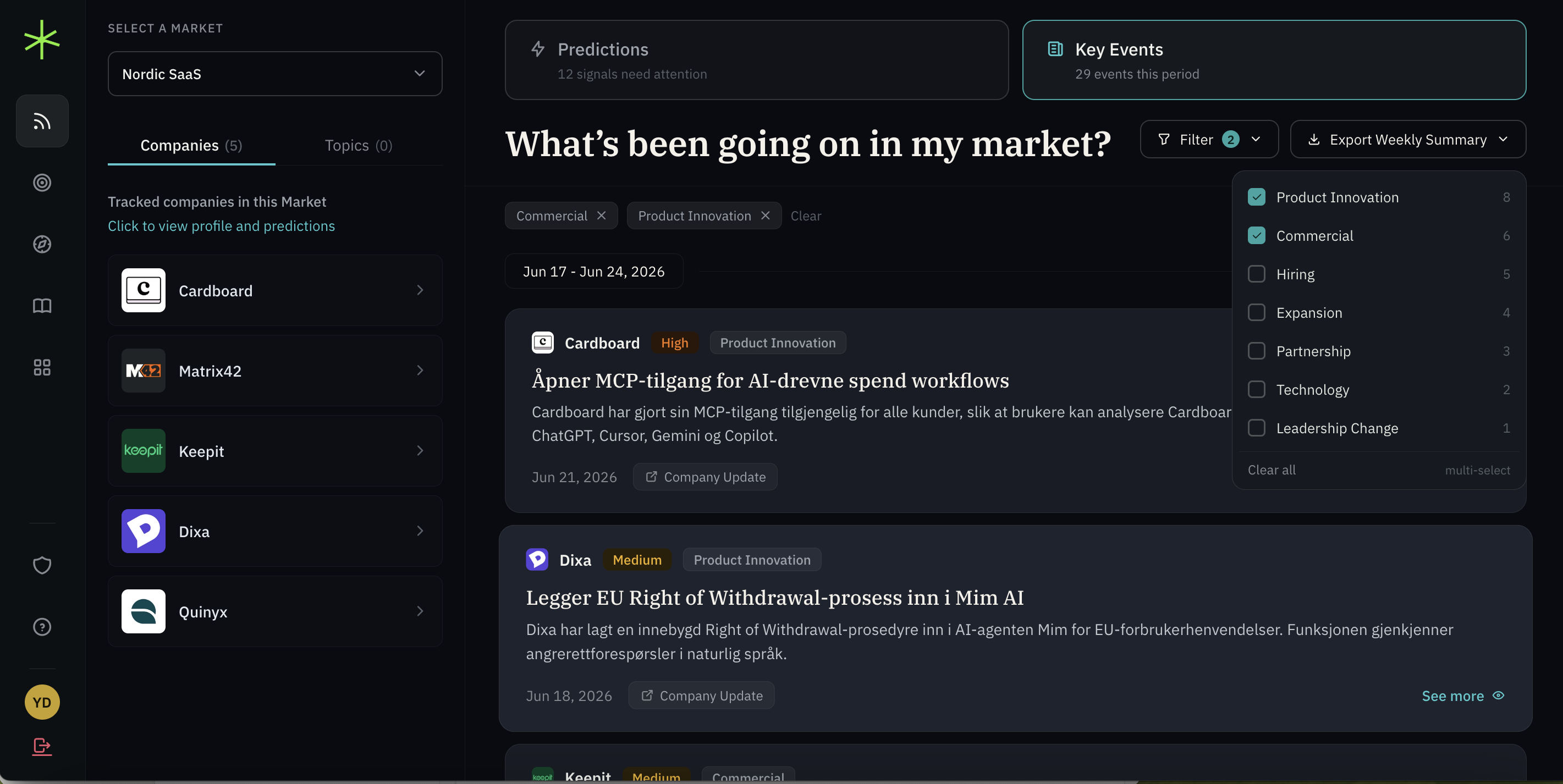
The platform's core value is its predictive signals: predictions about competitors' next moves, scored by impact level and tracked through a lifecycle. But when users first landed on the dashboard, what they saw was a wall of market feed.
Design System
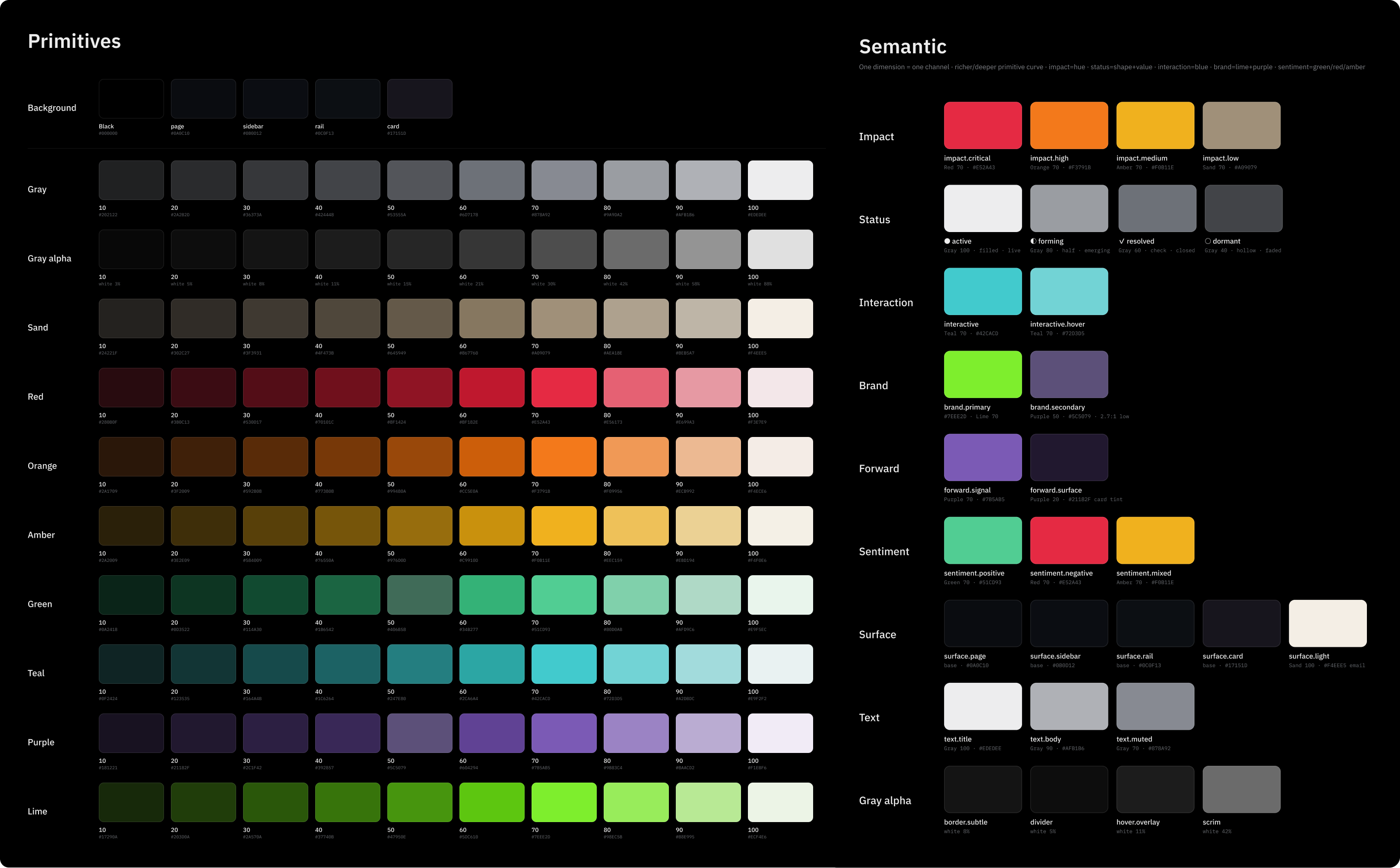
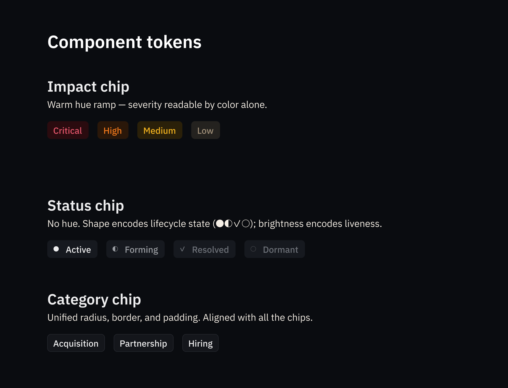
Primitive and Semantic Color Tokens
Before jumping into the redesign, I needed to set up a color token system.
How I approached it (all done in about an hour):
Audit first. I audited colors across the dashboard, email, and website to narrow down what was actually in use.
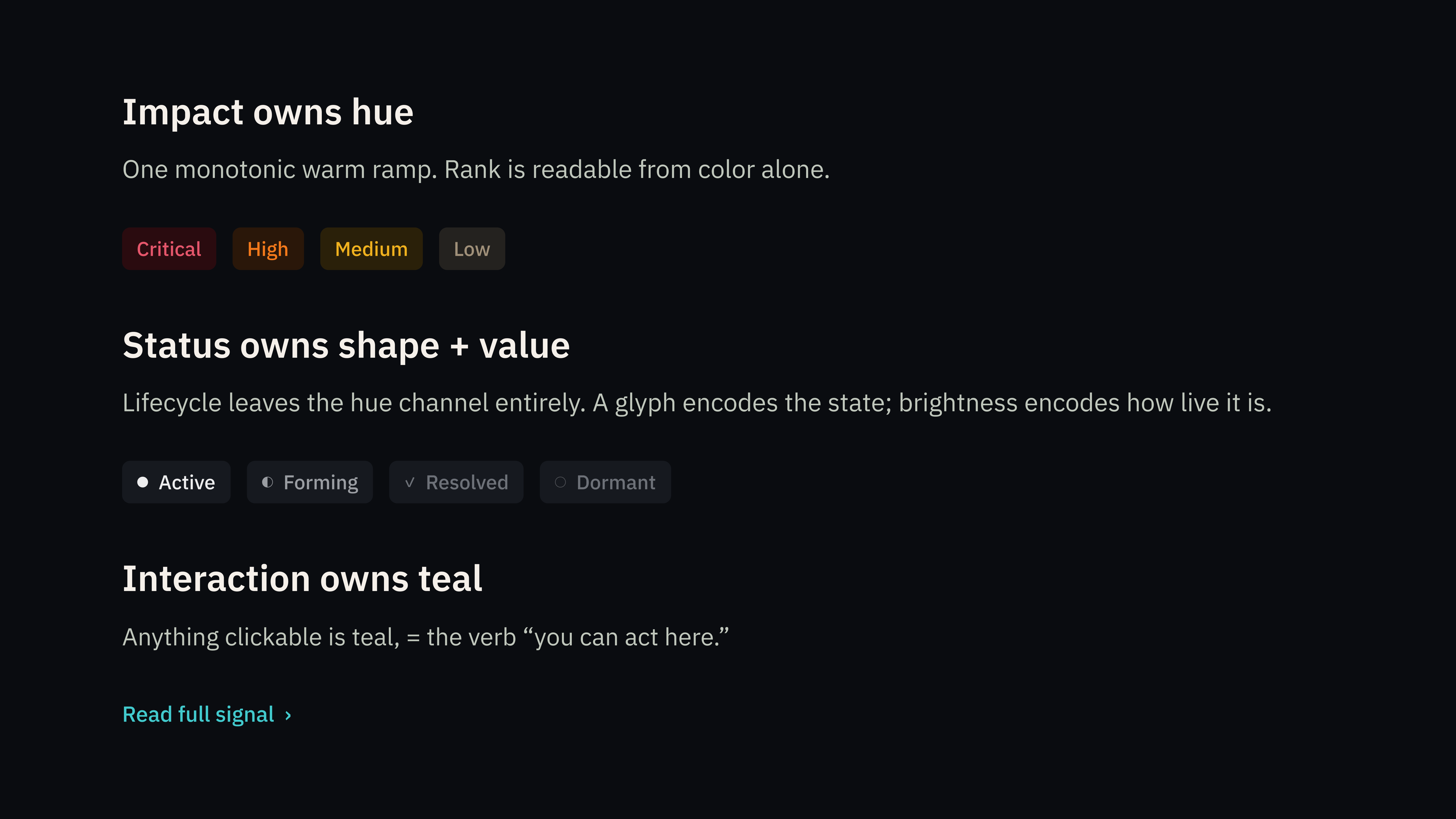
Define the logic. Color alone can't carry two independent dimensions. I worked through this with Claude Code: impact severity gets warm hues (red → orange → amber), while status gets shape and brightness (a filled dot for active, a half-circle for forming). One dimension per visual channel, no overlap.
Generate and publish. With Figma MCP connected to Claude Code, I generated the color scales, validated every token against WCAG AA on the dark surface, auto-set up variables in Figma, and published the library.
Deliver. Back in Claude Code with Figma MCP, I built the components referencing the token layer. Same token, same appearance everywhere. I then exported token JSON and component specs for engineering handoff.
HTML Prototype
Signals Up Front. Tab Between Views.
Rather than leaving the design in Figma, I built a fully clickable prototype in HTML and deployed it on Vercel — matching Paldo's visual design with real company logos, and the full token system applied.
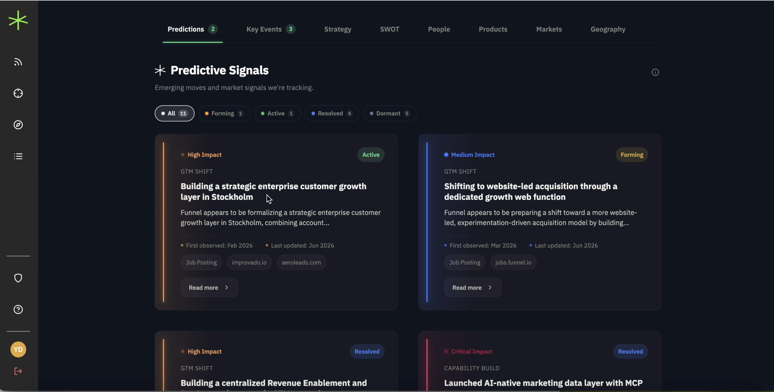
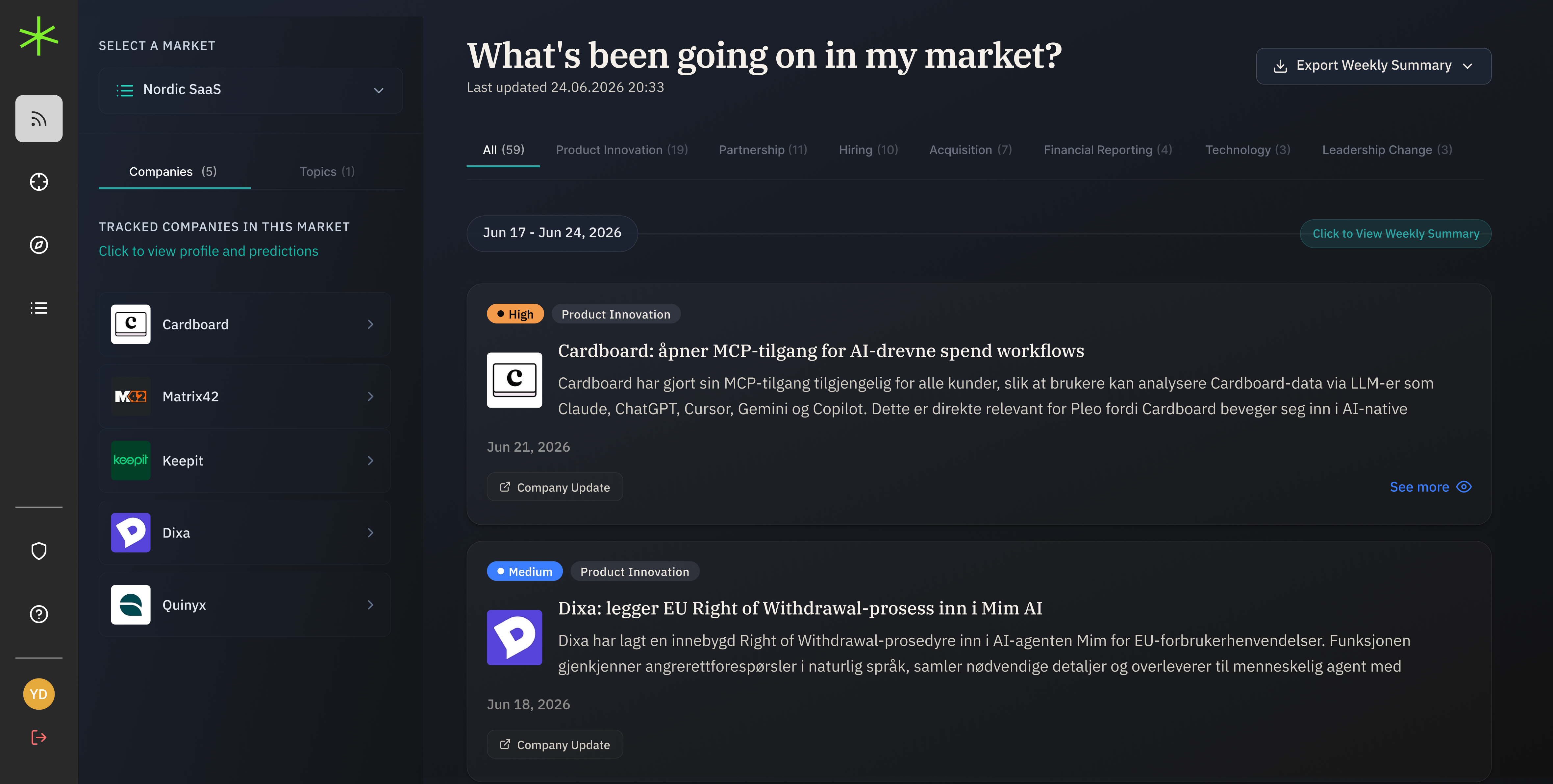
1. I split the dashboard into two views, switchable via a tab. This gave each view room to breathe without hiding content.
The Predictions view is cross-company — it surfaces signals across all tracked competitors, not per-company. Items appear only when they pass a threshold based on impact × status, so the list shows what actually matters, not a fixed number of rows.
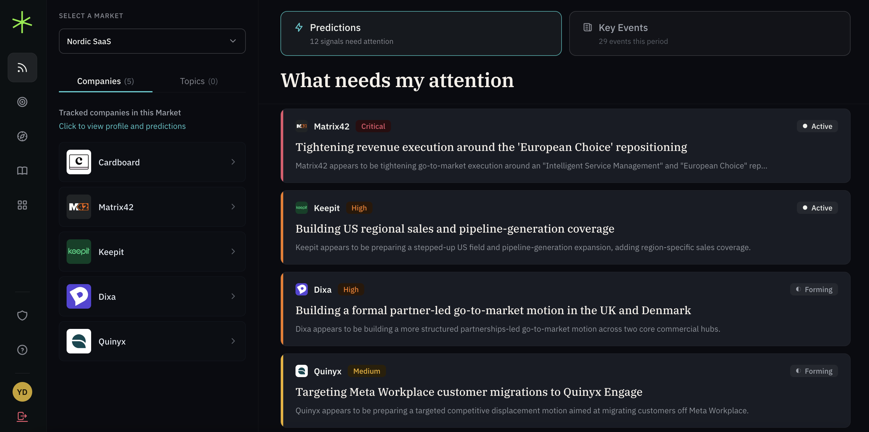
2. I replaced the original status tabs on Key Events with a multi-select filter popover, so users could cross-filter by category, status, or impact without leaving the page.
Final Design & Reflection
Shipped to Production in a Week
After reviewing the prototype, the founders, CTO, and the founding engineer were aligned.
Why it shipped in a week:
- 1.The color token system I set up upfront paid off here. The tokens were already structured and named, so implementation was essentially plug-and-play.
- 2.This project made me more deliberate about where I prototype. Because this was HTML, there was no handoff gap. Interactions, spacing, and component behavior were already real. So by the time the founders saw it, they weren't approving a concept — they were approving something that already functioned. That's what made alignment fast, and shipping faster.

