SoFi Round-Up Repayment
I worked on this project during the Technology-Driven Innovation course at CMU. By addressing a problem we care about, I focused on reimagining the student loan repayment journey to help borrowers save on interest and reach debt freedom faster.

The "Invisible" Progress of Repayment
1 in 5 Americans are dealing with student debt. The average borrower owes nearly $40k, and repayment can drag on for 20 years. Because the finish line feels far away, paying it off seems like a distant dream. When progress is invisible, it’s easy to lose motivation.
👥 The Average Borrower
Average Debt
Nearly $40K
Nearly $300/Month
Repayment Term
Around 20 Years
💸😞 User Reality
Borrowed $60K for her master’s degree in nursing
Has already paid over $66K, but still owes $61K due to interest
At this pace, she won’t finish paying until age 91
~Barbara, 62-years-old (Source: The Guardian)
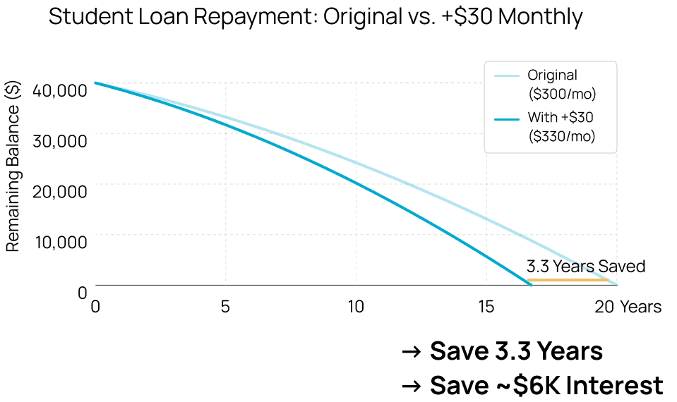
Insight: The Power of Paying Principal
During my research, I kept seeing the same pattern in success stories: borrowers found that chipping away at the principal could shave years off their loan terms. This proved that small actions can lead to a big impact over time.


"Paying extra that is required of me makes a huge difference in the long run."

"It’s asking if I want to have the extra taken off the principal amount of the loan or if I want to have it applied to next months total. Take it off the principal! It will save you interest in the long run."
How might we help people feel less stressed about collecting that “extra” amount while they are already dealing with heavy monthly payments?
Round-Up
To reduce the 'pain of paying,' I was inspired by the Round-Up model. Research shows that people are willing to part with that extra amount because spare change feels less significant.
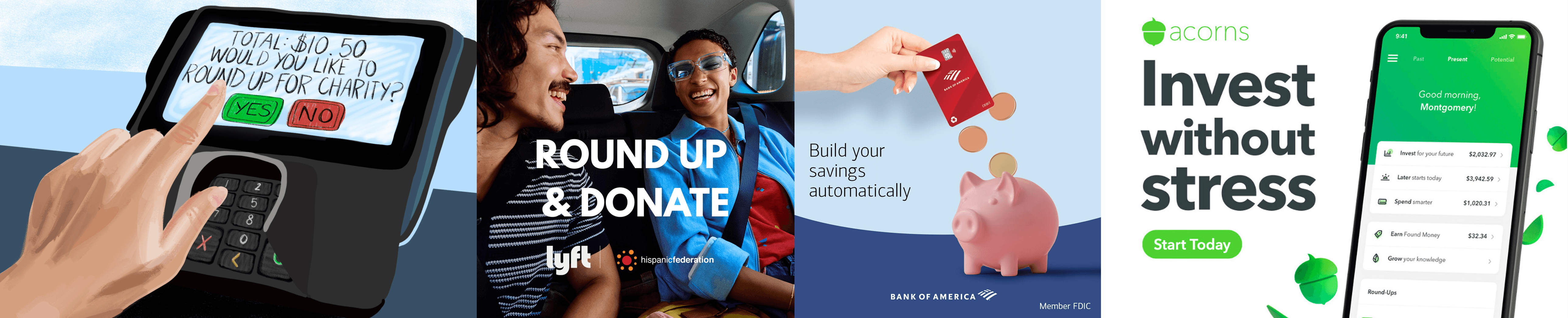
Users are already accustomed to rounding up—whether it's donating, investing, or saving during daily spending.
➡️ The market has validated that small change is a low-friction way to commit money.
Round It Up, Pay It Down
After considering business models, user trust, and market constraints, I decided to situate the solution within an existing banking ecosystem. This project is a conceptual feature for SoFi Bank, which has helped over 515K members refinance more than $46 billion in student loans.
How the Round-Up feature benefits SoFi’s Loan Business:
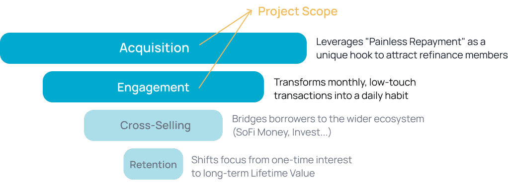
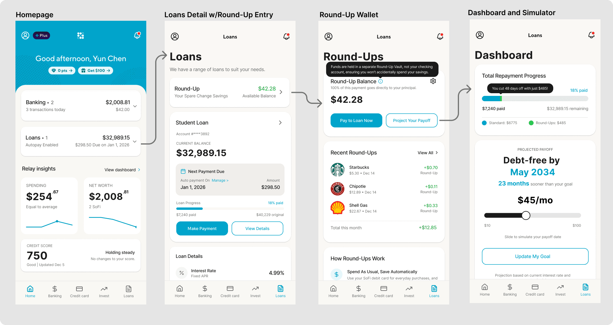
Integrating a Round-Up Feature into the SoFi Ecosystem
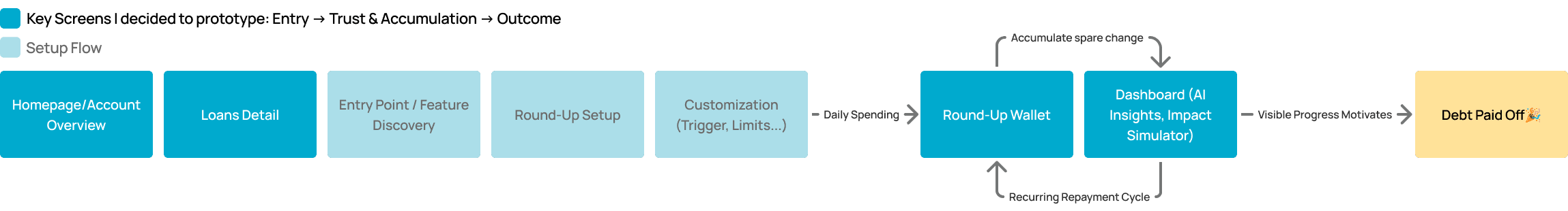
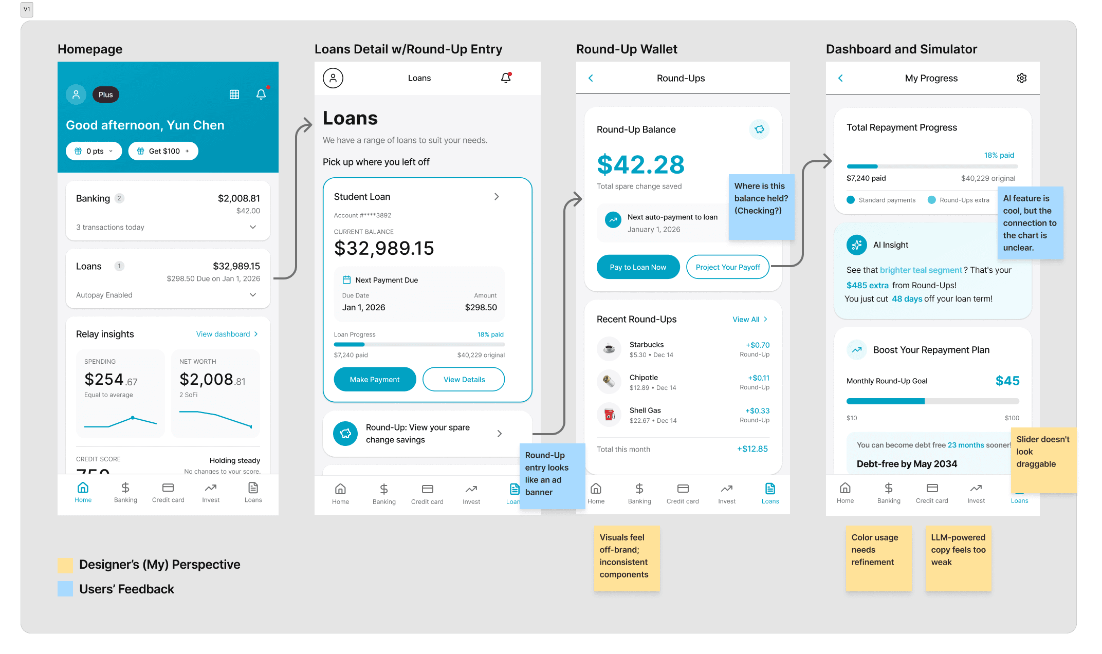
To visualize the concept, I started by mapping the critical user journey to identify daily interaction touchpoints. From there, I prototyped the four key screens that anchor this experience and conducted rapid user interviews to gather early feedback.
💡AI-Assisted Workflow:
I used Figma Make to rapidly generate the skeleton of the design, but realized that good design lives in the details. Rather than spending hours vibe coding to fix off-brand inconsistencies, I manually crafted the finer details to ensure the final quality met professional standards.
User Feedback & Visual Refinement & Brand Alignment
Without the official design system, I studied the app's patterns to align with SoFi’s brand identity. This allowed me to create a seamless interface that maintains visual harmony and hierarchy.
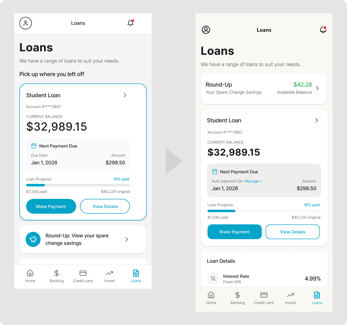
Users feel more motivated to engage when seeing the tangible balance upfront
Before: Round-Up entry looks like an ad banner
After: Move to the top, and seeing the actual number makes me want to click.
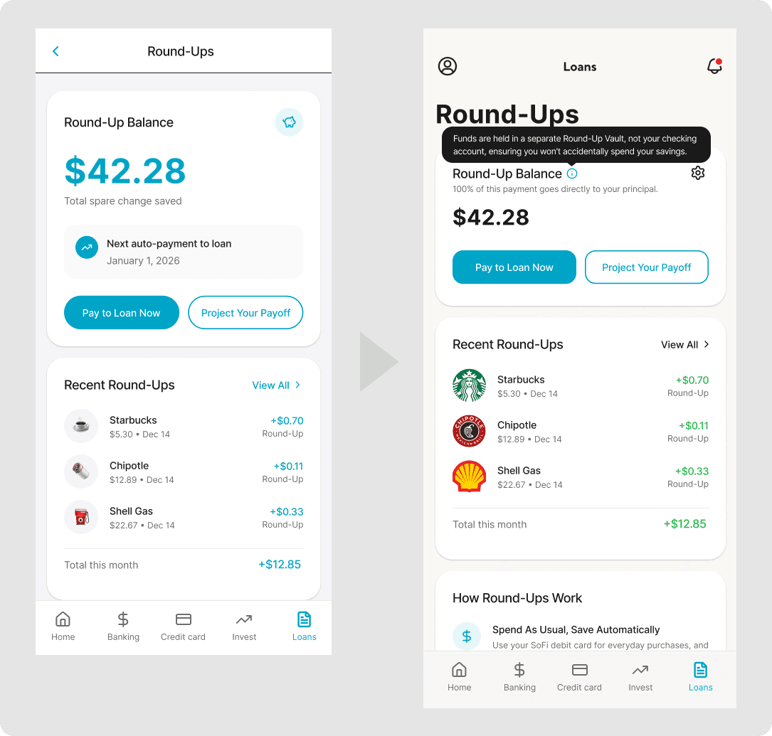
Ambiguity about fund location caused financial anxiety
Before: Where is this balance held? (Checking?)
After: Added a Tooltip stating funds are secured in a separate "Round-Up Vault." This provides immediate reassurance and trust without cluttering the UI.
Generic copy failed to motivate action
Before: Users were confused by the redundancy: "If auto-pay is set for Jan 1, why is there a 'Pay Now' button?
After: Shifted focus from "Schedule" to "Impact." By highlighting that "100% of this payment goes directly to principal," we clarified the unique value of manual payments—accelerating debt reduction—creating a strong hook to click "Pay to Loan Now".
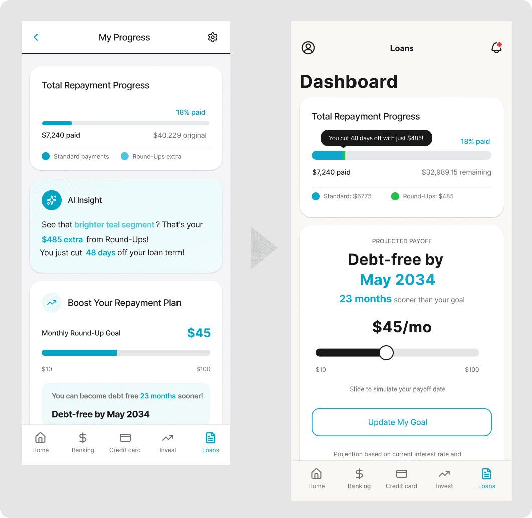
Visualizing the ROI of Spare Change
Before: Users had to read a separate text card to understand the chart's meaning
After: Placing the "48 days saved" insight directly on the chart creates a visual connection between money saved and time earned.
Enhancing Discoverability & Control
Before: The original design felt like a static indicator, lacking cues for interaction.
After: Redesigned as an obvious interactive slider, inviting users to experiment with different amounts to visualize a realistic payoff timeline.
After multiple rounds of iteration, here are the final screens:
The One-Person Product Team
Acting not only as a solo designer, but also as a PM defining strategy and an engineer validating feasibility.
💬Pivot: From Standalone App to Banking Feature
The project pivoted after “reality checking” with a VC. Since interest is the primary revenue source, helping users save it directly conflicts with business profitability. The solution was to reframe the feature as a user acquisition strategy for banks. This taught me to prioritize business logic alongside user experience.
🤖AI Accelerates Output, Not Outcome
AI tools allow me to create screens easily, but I realized that velocity is not a proxy for quality. Good design still lives in the details.